One of my favorite features in iOS 27 is the redesigned Siri. Nope, I’m kidding. It’s a tiny change most people probably wouldn’t have put on a WWDC wish list.
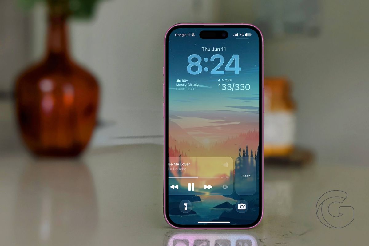
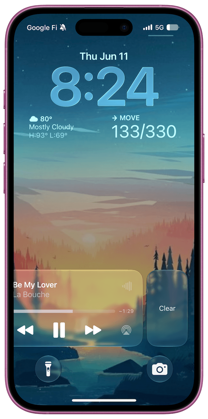
Apple finally lets you dismiss the Now Playing widget from the Lock Screen. Playback controls would stick around long after I was done using them.
The widget stayed put, taking up a chunk of the Lock Screen until iOS eventually decided to remove it on its own.
In iOS 27, you can simply swipe left on the Now Playing controls and tap Clear. The widget disappears immediately, along with the corresponding Now Playing indicator in the Dynamic Island.
It sounds insignificant until you start using it. I’ve always found it strange that Apple gave users so much control over their Lock Screen while leaving media controls largely untouched.
You could customize wallpapers, widgets, fonts, and shortcuts, but if the Now Playing panel appeared, you were stuck with it. That’s finally changing.
There are still a few rough edges in the current developer beta. Once you’ve dismissed the widget, getting it back isn’t always predictable.
In my testing, switching between media apps or restarting playback usually brings it back, but the behavior isn’t entirely consistent yet. That’s not surprising given how early the beta is.
What stands out to me is what this change says about Apple’s approach to iOS. For years, many software updates focused on headline features that looked great in presentations but had little impact on everyday use.
iOS 27 feels different. Alongside the bigger additions, Apple is addressing some of the smaller annoyances that users encounter dozens of times a day.
Being able to clear a media widget won’t sell anyone on a new iPhone. But it’s exactly the kind of quality-of-life improvement that makes the software feel more thoughtful.