
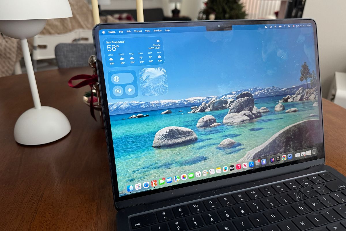
Apple has redesigned the volume and display brightness overlays in macOS 27.2 beta 2, replacing the continuous bars with segmented controls that make each adjustment easier to see.
I spotted the change while testing the second developer beta, released September 21 as build 26B5091g. Apple doesn’t mention the redesign in its release notes.
The thin bar used in earlier macOS 27 builds is now divided into individual segments, with each press of the volume or brightness keys filling or clearing one step.
The new controls are easier to read
The difference is immediately noticeable when adjusting either setting from a Mac keyboard. Instead of estimating your position along a continuous bar, you can see how many steps remain before reaching the minimum or maximum.

Apple has also simplified the icons. The new overlay uses a single larger symbol on the left instead of smaller icons at both ends of the control.
When the corresponding control is visible in the menu bar, the overlay appears directly beneath it.
The change is limited to the overlays triggered by the keyboard. Volume and brightness sliders inside Control Center continue to use the existing continuous design in beta 2.
Liquid Glass gets another small adjustment
The segmented controls retain the rounded, translucent appearance introduced with Liquid Glass in macOS Golden Gate, so this isn’t a return to the old macOS volume and brightness indicators.
Instead, Apple has kept the newer design while making the current level easier to judge at a glance.
In my testing, the segmented approach is noticeably easier to read than the continuous bar used in the initial macOS 27 release, particularly when making small adjustments with the keyboard.
It’s also one of the more visible interface changes I’ve found so far in macOS 27.2. The first beta focused largely on under-the-hood changes and known issues rather than obvious changes to everyday controls.
Apple hasn’t announced when macOS 27.2 will be released publicly, and the appearance could still change during beta testing.

