
Apple basically never admits they’re wrong. So when they show up to WWDC and actually acknowledge a mistake, even indirectly, you know something big is shifting behind the scenes.
That’s exactly what happened with Liquid Glass, the shimmery, translucent design system Apple rolled out last year.
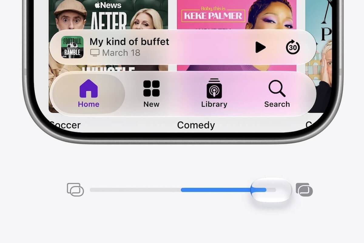
The reaction from everyday users was… mixed. And now Apple has done something genuinely unusual for a company of its ego: it built a slider that lets you dial the transparency up or down, all the way from totally see-through to fully opaque.
The Part That Actually Bugged People Most
If you used any of Apple’s apps last year and noticed the sidebar icons had lost their color and were replaced by that frosted, glassy look, you weren’t alone in finding it annoying.
Turns out enough people complained that Apple is bringing the color back. Sidebar icons will now keep their original hues instead of disappearing into the glass effect.
The sidebar itself is getting a structural fix too. Previously, the refraction effect that gives Liquid Glass its depth would cut off at the sidebar boundary, which looked more like a design oversight than an intentional choice.
Now those effects run all the way to the edge of the window, so the whole thing feels more cohesive.
They’re Doubling Down on the Icons Too
While part of this announcement is clearly about calming down the people who found Liquid Glass overwhelming, Apple isn’t retreating from the concept entirely.
The app icons, which were all redesigned last year to look more unified across devices, are now getting actual Liquid Glass layers baked directly into the artwork. So the look is evolving rather than disappearing.
What makes this whole thing interesting is the posture. Apple acknowledged user feedback, used the phrase “deeply appreciates” about it, and then actually changed the product.
For a company that once removed the headphone jack without blinking, that’s a different kind of energy.

